
Anechoic SAL Week One: Understanding colour value
Welcome to the first week of the Anechoic SAL!!
This week is all about picking your fabrics and delving into colour values. I'll admit - this quilt was a crash course in colour for me. Previously whenever I heard the term "colour value" in the Quiltaverse or read about how it's useful to turn a photo of your fabric/blocks into black and white, I would inevitably end up going "Cool, it's all grey" and move on.
This summer my brain was ready for colour, but choosing the Anechoic cover quilt colours was hard! I had never worked with such vibrant colours before. Before starting a quilt, I always mock the pattern up, but my computer screen didn't seem to have enough pixels to capture the richness of those fabrics in real life. I relied on my creative intuition, but it felt uncalibrated in that part of the colour spectrum. The quilt still turned out great! But I probably could've gotten an more punchy 3D effect if I had used colour values in picking my fabrics.
So what is colour value anyways? And why do we care?
Simply put - colour value is a measure of how light or dark a colour is. If a colour is closer to black, it would be considered to have a low colour value. If the colour is closer to white, it has a high colour value.
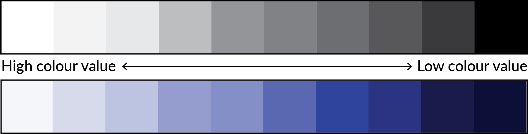
For choosing your Anechoic fabrics, you want fabrics with a gradient of colour values to maximize the 3D effect of the pattern. Fabrics A and D should be the most different with Fabrics B and C falling evenly in between them.
Now this is where pre-Anechoic Janice would usually be tuning out and moving on. Bear with me!
Case Study #1: Cover Quilt
When you look at this photo, which quadrant looks like it's popping out the most? Blue, green, pink or orange?
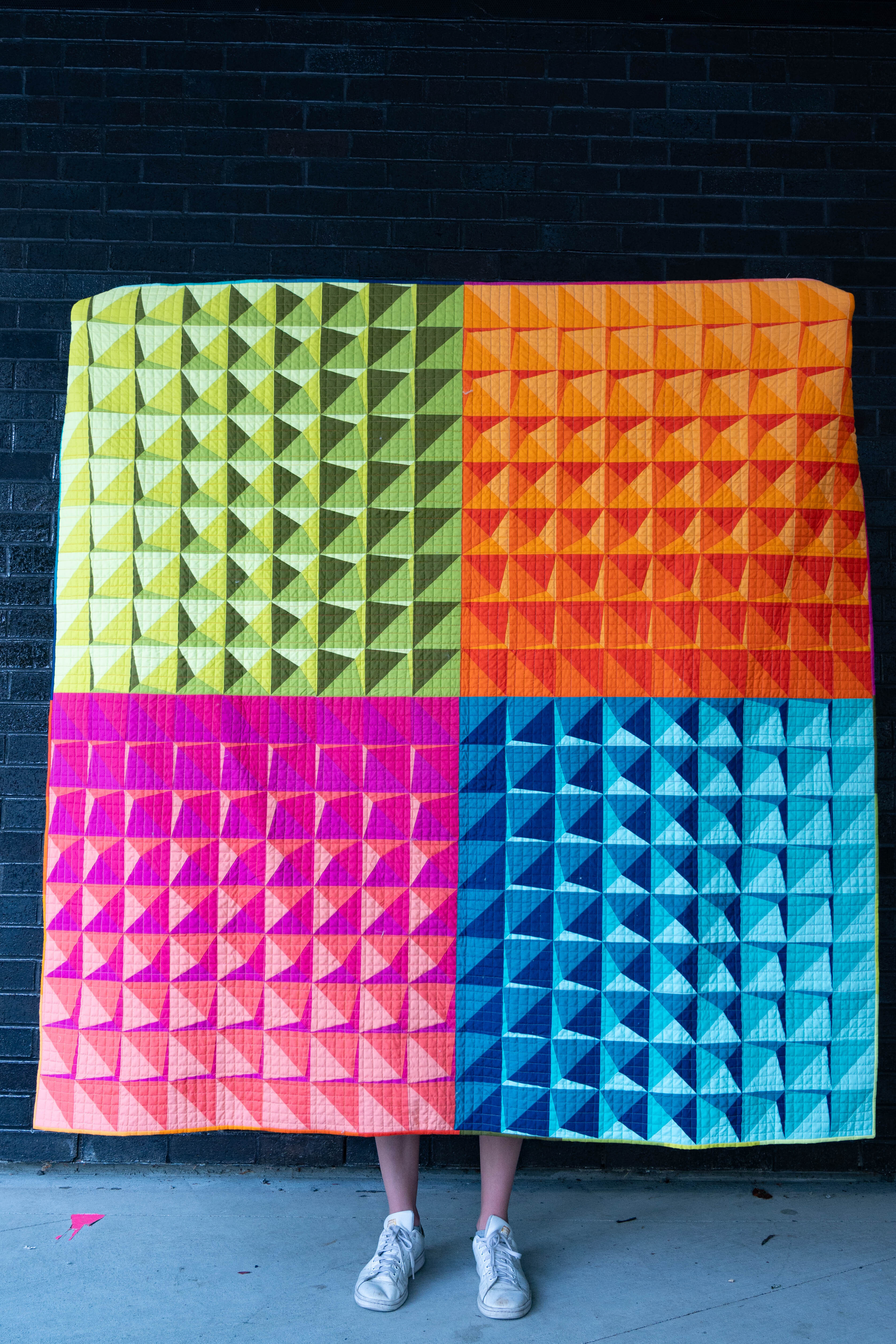
Did you answer blue?
The reason why the blue quadrant produces the biggest 3D effect is because it has the greatest difference in colour values between the fabrics.
Let's take it into black and white.
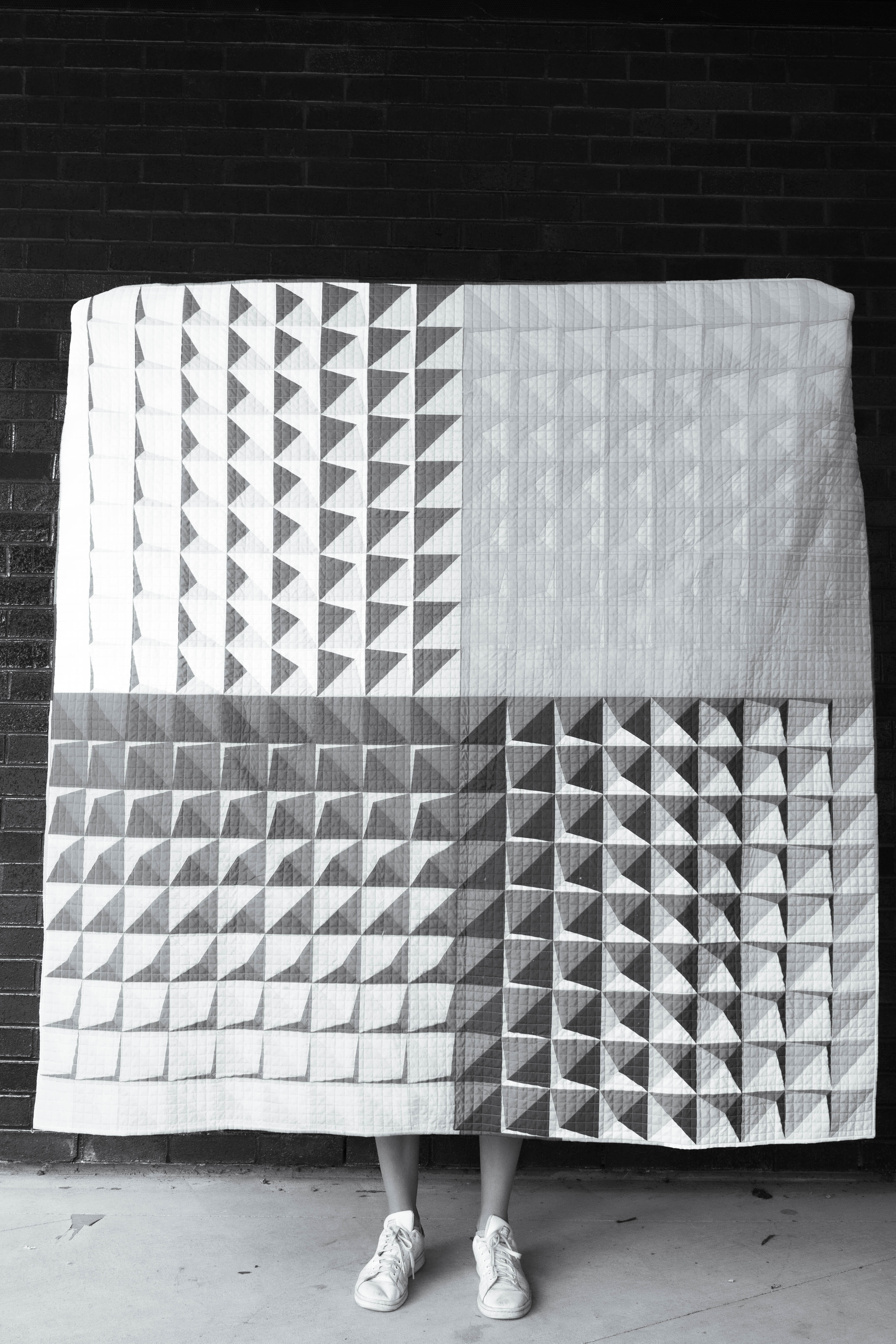
Look how the blue quadrant pops!
Let's try to explain that using colour values.
Blue - Each fabric is a distinct shade of grey, meaning it has a distinct colour value relative to the other blue fabrics, and they are evenly distributed along the gradient. This is what 3D dreams are made of!
Green - Fabrics A and D have a great value difference - check! However, although the difference between Fabrics B and C is good, they both need to be shifted to a lower/darker value to even out the value distribution between the four fabrics.
Pink - It was close! If Fabric A was a little lighter, I think this would be been popping.
Orange - Fabrics B,C and D all have the same colour value, resulting in an underwhelming 3D effect. This really surprised me! Is there even a value gradient??
How are we doing? Are we feeling like this yet? I hope so!
Case Study #2
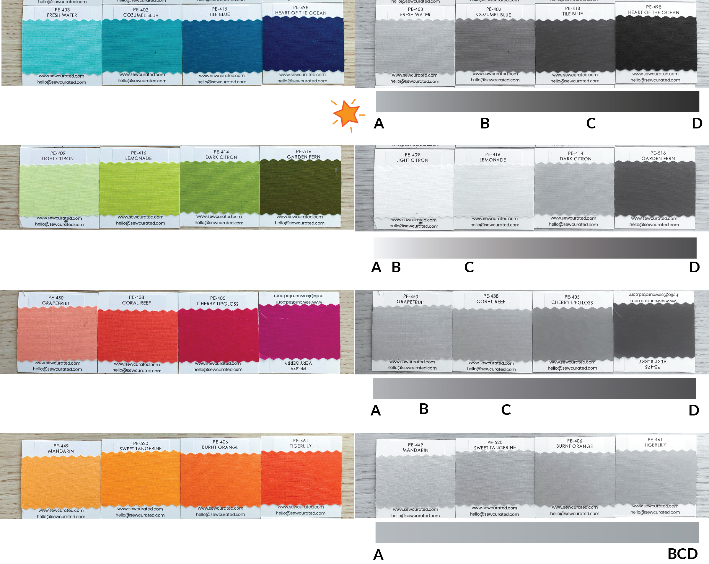
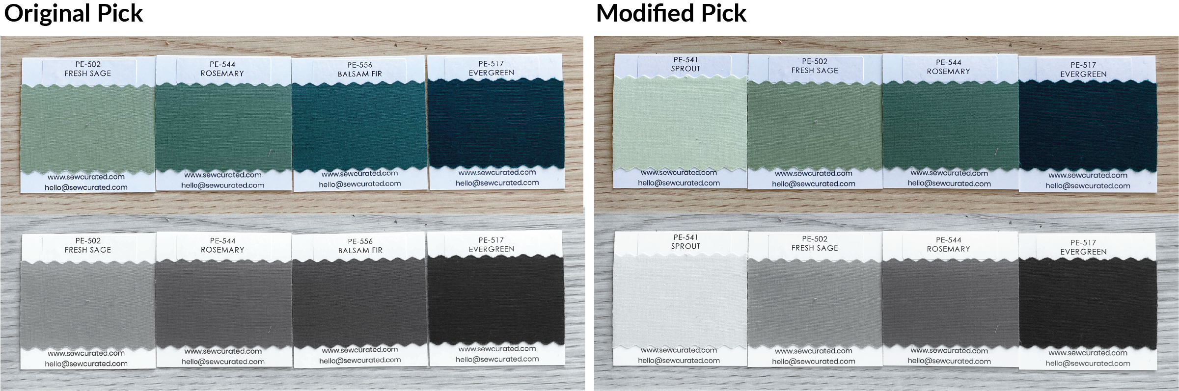
I absolutely love using AGF PURE solids in Evergreen, Balsam Fir and Rosemary. I've made a couple quilts with them and keep coming back to those fabrics.
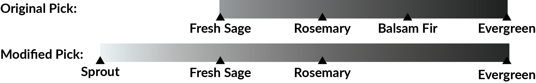
I originally decided to mock up Anechoic in Fresh Sage, Rosemary, Balsam Fir and Evergreen. By eye, I thought I had done a pretty good job picking fabrics with different colour values. And I did! When I look at the B&W version, the spacing between the greys is pretty consistent.
But when I mocked it up, it wasn't quite punchy enough. I modified the fabric picks to exaggerate the gradient even further to really maximize the value difference between Fabrics A and D.
See how the modified pick has a gradient that covers a broader range of colour values?
Here are the mock-ups:
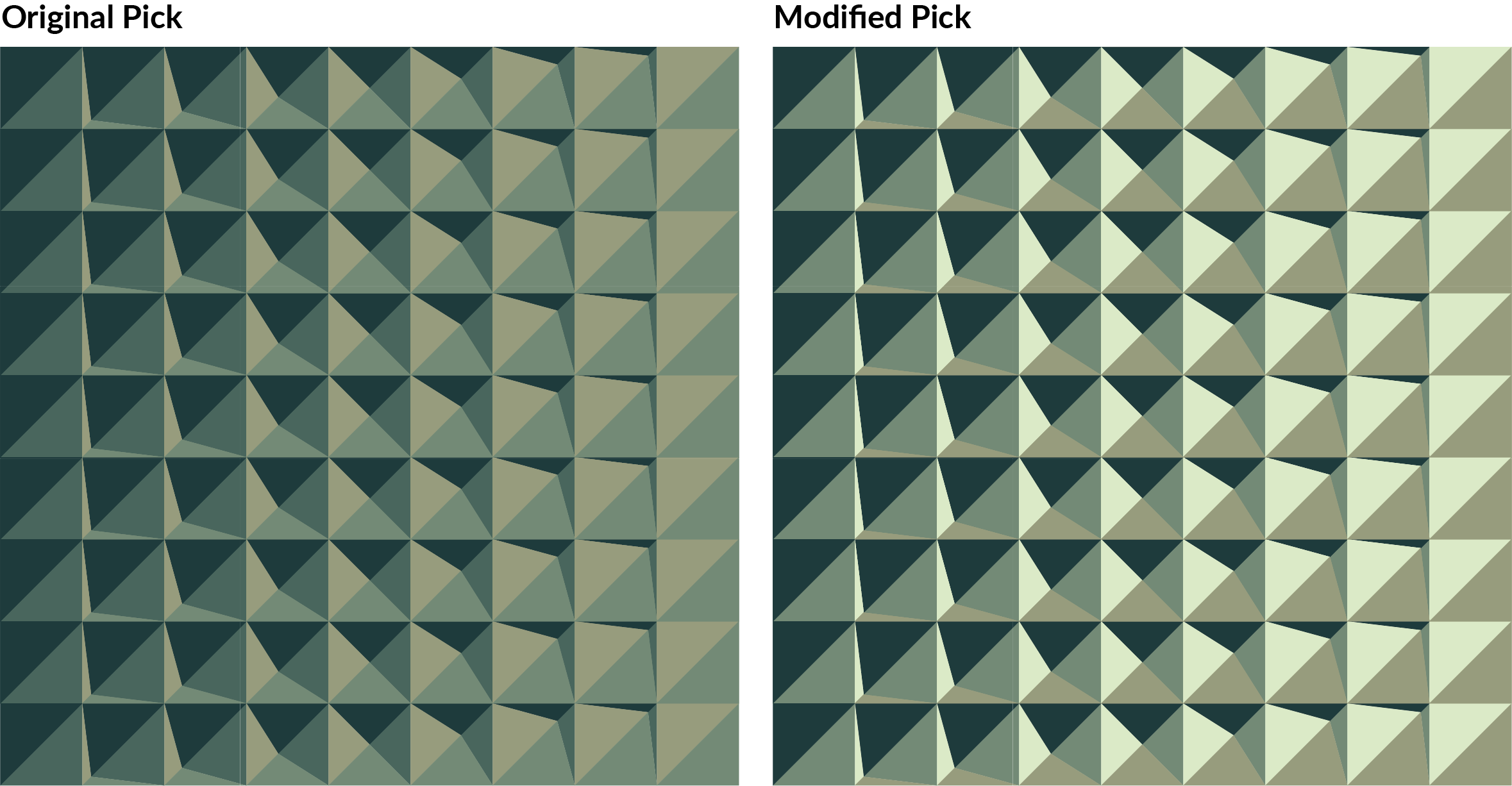
Both have a 3D effect, but the modified pick is jumping out of the screen at me!
I hope you made it this far and that colour value makes a little more sense. I still have lots to learn, but it's been so useful having a practical example of what did and didn't work in the same quilt. I still love my cover quilt version, and sometimes the fabric colour you need doesn't exist, but have fun with it! Try colours you wouldn't normally choose, and I'll meet you back here next week for some cutting tips.
Interested in the AGF fabric colour swatches above?? As someone who orders 100% of her fabric online, these swatches have become an invaluable tool for me. Lisa of Sew Curated has made an outstanding product, and I'd be lost without them. Check them out here.
Sew Curated is also sponsoring the SAL!! She is giving away one set of swatches to one participant of the Anechoic SAL!*
Prize details are still be organized, but sign up and stay tuned for more details.

*Limited to Canada and USA